When I started quilting, the process of selecting fabric for a project intimidated me. Going into a quilt shop and picking everything I needed was agonizing and time consuming and usually required multiple trips to more than one quilt shop ... sometimes in more than one state.
As a new quilter choosing fabrics, I went with my gut. The more quilts I make, though, the more I realize the process isn’t as simple as “I used these fabrics because they’re pretty together.”
I thought it would be interesting to look at the criteria I use when pulling fabric for a new project and then see how my selections play out in a finished quilt top. If you find yourself following the same—or different!—criteria, I’d love to hear about it in the comments. Also, if you like this kind of content, let me know. It’s fun to write posts like this and even more fun if there are readers who like to read them.
When I’m planning the fabric for a quilt top, four key factors pop in my mind:
Palette: This is the colors I choose to use in a quilt. Quilters can find color inspiration everywhere. I like to start with an interesting fabric and work from there.
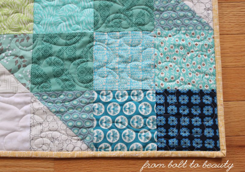
Scale: This is the size of the design elements of a fabric. For some quilts, I might choose all small-scale designs or all large-scale designs. Or I might purposefully pick a combination. Each approach produces a different effect.
Volume: This refers to the intensity of color in the fabrics. Like scale, I might focus on one end of the spectrum or the other—that is, a bunch of high-volume fabrics or low-volume ones—or I might use a combination.
Overall feel: This is the result I’m ultimately trying to achieve. I may want to create a bold, modern, masculine quilt. Or I may be going for something soft and ethereal. Whatever the intended effect, it influences the palette, scale, and volume decisions I need to make.
The Beginning of My Foxy Quilt
After paper piecing
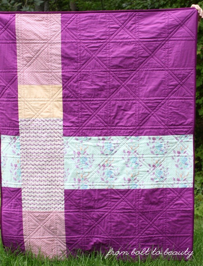
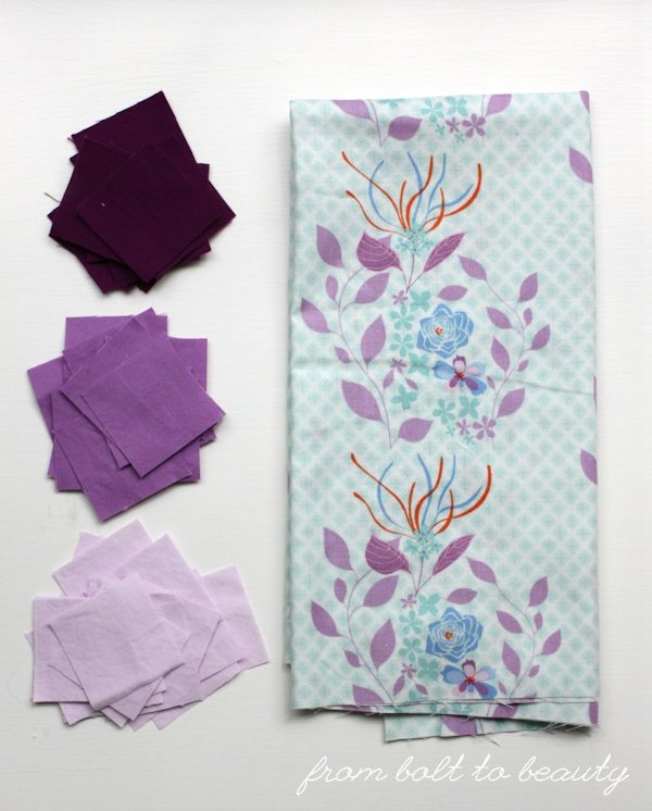
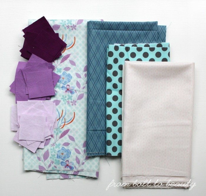
Grape Fizz, I had a bunch of 2” purple squares left over. I paired them with an older print—Hothouse Flowers, by Mo Bedell—and thought I had the start of something interesting.
I decided to sew a
Penny Patch Quilt. I’ve been meaning to make this pattern, by Rachel Hauser, for a few years. It’s a great design because it calls for squares in three sizes: 2”, 3½”, and 6½”. With these sizes in mind, I could cull through my yardage
and my scrap bin to come up with the right combination of fabrics.
Fleshing out the Fabric Pull
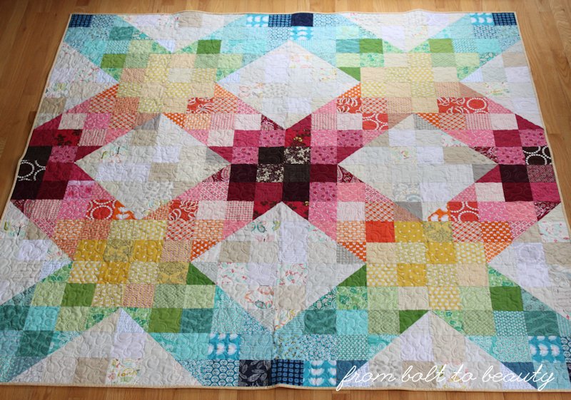
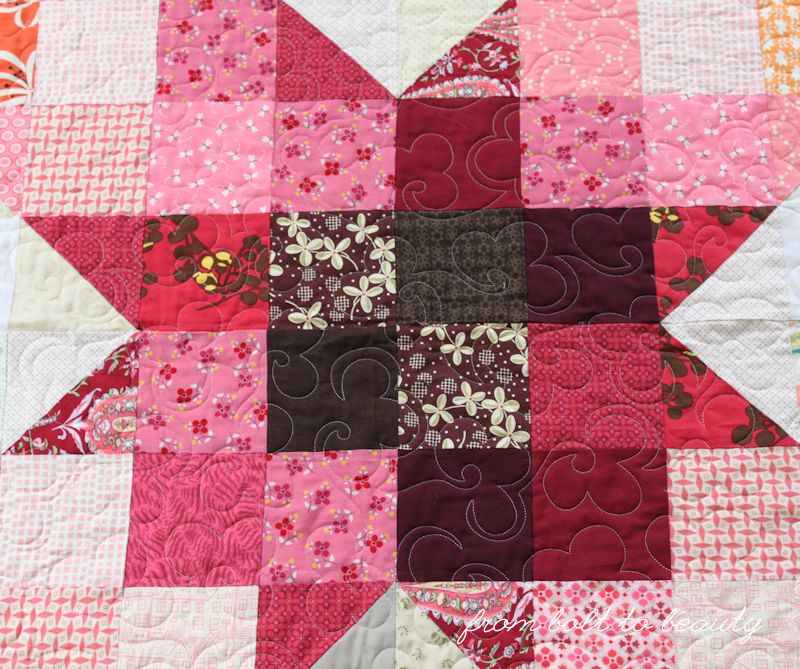
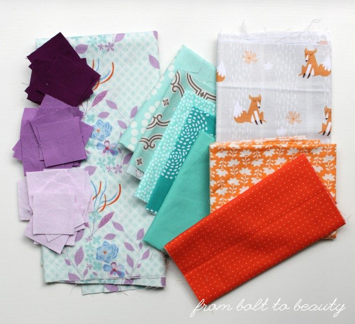
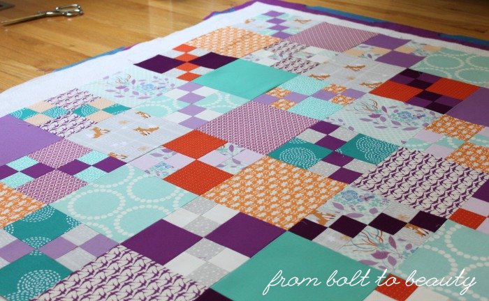
The Hothouse Flowers print was a great starting point. It’s feminine and whimsical, and has a bunch of different colors in it. I fleshed out the palette for a little-girl quilt from that fabric. To the floral yardage and purple scraps, I added some teals, a novelty fox print (Wonderful Woodlands by Arrolynn Weiderhold for Wilmington Prints), and some oranges.
As I was assembling my fabric pull, I was looking for patterns that varied in scale and volume. That contrast creates interest for me. That’s why I chose solids and patterned fabrics, low volumes (like the foxes) and high volumes (like the orange Zen Chic dots), different kinds of geometrics (some predictable and uniform, like the Lizzy House pearls, and some less so, like the dashed concentric circles).
I started cutting and laying out the blocks. I knew the zingers in the mix were the deepest purple scraps and those orange Zen Chic dots, so I only used them for 2” and 3½” squares. They were so eye-catching that they could have overwhelmed the quilt in 6½” chunks.
Scrapping the Rejects
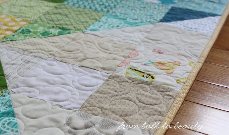
I wanted the final quilt to be feminine and youthful with a softness to it, and not all of my fabrics made the cut. Ultimately, the second teal from the top in the picture above wasn’t working. I thought the contrast between the pale teal and rigid design could overshadow the real stars: the Hothouse Flowers print and fox fabric.
The pieces on the right, below, were also edited out ...
The blue crosshatch has a vintage feel to it, which I wasn’t going for in this project, and against all the purples, the color just seemed boring.
The blue and brown dot, with its sharp contrast and strong geometry, would have upstaged some of the other fabrics and undermined that sense of softness I was going for.
I thought the pale-pink Lizzy House jewels could work with the other low volumes, but it was too pink to play with the purples.
The Final Reveal?
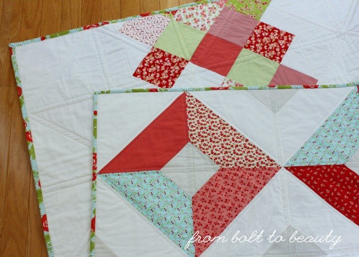
I am still quilting this throw, so a full reveal will come in the next week or so. But here’s a sneak peek of it when I was basting. I’m really pleased with the balance of colors and patterns that I was able to achieve. And did I mention this fabric was all from my stash? Woo hoo!
What does your fabric-selection process look like? What factors do you consider?
Linking up to
Let’s Bee Social and
Needle and Thread Thursday ...