Showing posts with label Kate Spain. Show all posts

Friday, December 1, 2023

Elizabeth Hartman's Legendary Pattern / Beauties Pageant 238

Back in 2017, Elizabeth Hartman released her Legendary quilt pattern, and I was dubious. It was a cool design, but was there really a market for a Sasquatch quilt pattern? 

Six years later, I realized that, with a few palette decisions, I could transform Sasquatch into a yeti, and obviously, I need a yeti quilt in my life.

Yetis, or abominable snowmen, are a running joke between me and my older son. Over the years, I have bought him yeti Christmas ornaments, yeti stuffed animals, yeti washi tape, you name it. As his 15th birthday appeared on the horizon (and by this, I mean it was just three weeks out!), I knew I had to move into high gear and get this project done.

Essex Linen

Thankfully, I had already cut out almost everything, including five different green fabrics for the forest. The dark greens are two prints from Cotton and Steel past and present, and the lighter, brighter greens include a solid, a blender, and a print from Kate Spain’s Grand Canal collection.

For the background I used Essex Linen. It was something I purchased for a different quilt, one that requires a lot of fiddly curve sewing, and I am thankful I used that cut of fabric here instead. 

Now, I am not an Essex Linen novice. I’ve used it a variety of projects, most of which are bags, not quilts (see the links at the bottom of the post). In other words, I know Essex Linen’s lovely, textured hand can be annoying to work with. It’s malleable and stretchy and not nearly as well behaved as quilting cotton. So I took precautions: I washed the Essex Linen (and all the other fabrics, for that matter) and I gave it a good press with starch.

I chain-pieced 12 of the 14 tree blocks right off the bat. As I squared the blocks, though, I realized that I would lose some points when I sewed them into the quilt top. I blamed this (ahem!) on the fact that I did not mark the diagonal seams before sewing them and instead just eyeballed everything. But then I cut and sewed the final 2 tree blocks, diligently marking every diagonal seam with my hera marker, and they were not any more accurate than the first batch I sewed. Sorry, Essex Linen, it’s not me, it’s you!

The Quilting

There was no way I was going to quilt a project with this much Essex Linen myself. On one hand, I think Essex Linen merits a good amount of quilting to stabilize it. On the other, too much quilting could result in a top without much drape.

I decided on a pantograph called Ramble, and I couldn’t like it and the scale my longarmer decided on more. I had considered different designs that played up the forest theme, but this modern geometric seemed more appropriate for its 15-year-old recipient.

I’ve been second-guessing my thread choices of late (remember this quilt?), and Legendary was no exception. My usual rule of thumb is to use the lowest value in a quilt top as the color for the quilting thread. Instead, I went with a medium gray option here, which makes the quilting recede on almost all of the blocks and the background. Don’t get me wrong: I really like it. I can’t help but wonder, however, what Ramble would look like with an off-white thread.

The Backing and Binding

A flannel from Tula’s Holiday Homies collection was the perfect foil to all that Essex Linen. And I finished everything off with a solid binding, also from Tula, in matcha.

I knew I would miss an opportunity to add another layer of texture if I machine-finished the binding, so the time required to sew these chunky stitches was well spent, even if I was still at work on it the day before I planned on gifting the quilt to my son! (For a tutorial on chunky-stitch bindings, click here.)

I divide Elizabeth Hartman’s pattern design into two phases. Her earlier work, including the designs in her two books, is mostly geometric. The ones that do have a novelty feel to them (like these cats, which are freebies on her site) are fairly simple to make. Most of what she designs now is much more complicated. I’ve heard friends talk about all the pieces required to sew her sloths or her dinosaurs, and I cringe. Legendary may be part of her later work, but despite my woes with lost points, it’s pretty easy. If you have a reason to sew a Sasquatch quilt or, like me, a yeti version, I recommend it!

Other quilts from Elizabeth Hartman’s patterns:

Other quilts made with Essex Linen:

Follow Me On ...


* * *


The pageant rules are simple:
  • Post your finish in the linky tool. (No links to your own giveaway or linky, please!)
  • Point your readers back here with a text link or use the button above.
  • Visit and comment on other participants’ finishes.

You are invited to the Inlinkz link party!

Click here to enter

Friday, October 6, 2023

One Quilt Four Ways / Beauties Pageant 231


I fell down the rabbit hole that is EQ7 last weekend. But can you blame me? It’s satisfying to see how different fabric collections would look in a quilt design without sewing a stitch.

What you see here is my Double-Sided Diamond Quilt, a layer cake-friendly pattern that I wrote about last week, in four different Moda collections. (Pssst ... Moda didn’t put me up to this post. I just like the company’s modern designers and consider it the OG precut manufacturer!)

Dawn on the Prairie

Designer Stephanie Sliwinski of Fancy That Design House caught my eye back in 2021 with her debut collection, Songbook. I’ve loved the floral designs and palettes in every collection of hers since then. There’s just something different about them. Check out her latest line, Dawn on the Prairie, at the top of the post. See what I mean? The color combination isn’t one I could have developed myself, and it’s so good. The earthy tones in rust, brown, and charcoal are surprisingly good companions for blush and mustard. Beautiful!

Fruit Loop

I am a big fan of Basic Grey—just check out the 40-some posts of mine that reference the design house (click here). I am especially drawn to its collections with gray undertones. (Some—like Nutmeg, Cider, and Persimmon—have more brown undertones, and they’re not my thing.)

Fruit Loop, pictured below, hasn’t been released but is circulating on social media. It’s a different kind of collection for Basic Grey, with all those bright fruit-themed prints, while remaining true to the design house’s aesthetic. And it has a black colorway, which pretty much seals the deal for me!


Sunflowers in My Heart

I credit some of my brightest quilt projects to Kate Spain, whose use of color often pushes me out of my comfort zone. I especially like her use of pinks and reds (check out my first Plaid-ish quilt and my first Warm and Cool Coin quilt). 

Her latest fabric line, Sunflowers in My Heart, is in my mind pretty different from her other collections, but maybe it’s just the way I mocked up this quilt design. I think of it as a blue fabric collection. Perhaps if I had used a different color on the mocked-up backing I would say otherwise? (You know I’m going to go straight to EQ7 and find out as soon as I finish this post!) Way way or another, it’s really lovely, and I’m especially smitten with the large-scale floral print.


Lighthearted

And then there’s Lighthearted, the collection by Camille Roskelley I included in last week’s post. Lighthearted is a throwback to when Camille designed collections with her mom and features the signature Bonnie and Camille color palette, with pink, a not-quite-red hue, aqua, and grassy green.

And that concludes my spate of precut-focused blog posts. You can click through to the previous four posts with the links below. And stop back next week, when I will unveil my two Postcard from Sweden quilts!

My latest precut posts:

* * *

The Double-Sided Diamond Quilt is one of my Almost Free for Charity PDF patterns. 

It’s just $3 in my pattern shop, $1 of which goes to an organization supporting the Down syndrome community.

Follow Me On ...


* * *


The pageant rules are simple:
  • Post your finish in the linky tool. (No links to your own giveaway or linky, please!)
  • Point your readers back here with a text link or use the button above.
  • Visit and comment on other participants’ finishes.

You are invited to the Inlinkz link party!

Click here to enter

Friday, June 16, 2023

A Plaid-ish Finish! / Beauties Pageant 220

A guildmate once shared a scrap quilt of hers in which there were no repeats—each fabric was used just once. Can you imagine the scrap bin necessary to create such a masterpiece?! Although a challenge like that would be a worthwhile one, my taste in scrappy quilts swings to the other end of the spectrum. 

First, I like my scrappy projects to have a strong geometry. Sharp, predictable lines create an orderly environment for me and my scrap bin to play. Then I need a well-defined palette to reign things in—I can’t handle what I’ve heard others refer to as “scrap vomit”—and my favorite way to develop a color scheme is to use a few fabrics as inspiration. 

My latest finish, a second go-round with Kitchen Table Quilting’s Plaid-ish pattern, meets both of those criteria. I started with a few prints from Kate Spain’s Sunnyside, and from there fleshed out a sizable  enough fabric pull to complete this 64-inch by 82-inch quilt.

Some fabrics make a single appearance, but there are many others that are represented a half-dozen times or more. I like that kind of repetition in my scrap quilts—it creates some cohesion and helps me bust through a few fat quarters while I chip away at my stash of scraps.

I’d be remiss not to mention the beautiful quilting in this finished quilt. It was done by my friend Ophelia and is a pantograph by Urban Elementz called Diamond Plaid. Those angled lines soften the horizontal and vertical seams in the piecing, don’t they?

To read more about how I built my palette (and expanded it when necessary), click here. To see my first Plaid-ish quilt, read this blog post. And to make your own Plaid-ish, visit Kitchen Table Quilting and click on “tutorials.”

 I have more to say and show you about this Plaid-ish finish. Come back next week to see what I did with the back. Spoiler alert: I used Kelly Young’s new book, Perfectly Pieced Quilt Backs, to make it!

Follow Me On ...


* * *


The pageant rules are simple:
  • Post your finish in the linky tool. (No links to your own giveaway or linky, please!)
  • Point your readers back here with a text link or use the button above.
  • Visit and comment on other participants’ finishes.

You are invited to the Inlinkz link party!

Click here to enter

Friday, April 14, 2023

Another Plaid-ish Quilt / Beauties Pageant 212

I am always on the lookout for scrap-busting quilt patterns, and perhaps the best one I’ve found is Erica Jackman’s Plaid-ish design. This pattern, free on her website, is brilliant both in its simplicity and in the amount of fabric it uses. Plaid-ish requires no background fabric—just scraps sorted into light, mid, and dark values—and finishes at 64 inches by 82 inches.

The challenge to tackling a Plaid-ish quilt starts with determining a palette. (Erica has a less-structured approach to pulling fabric for this design. Check out her corresponding highlight on Instagram to learn more.) Because the largest cut piece in Plaid-ish is a 5-inch square and because Kate Spain is a master of color, I opened up a charm pack of her long-out-of-print Sunnyside as the basis for my quilt.

I took a stack of light and mid tones from Sunnyside and built from there. No orange was deep enough to be considered a dark value, but I uncovered plenty of purples, teals, and grays from my scraps and stash that fit the bill.

I did this initial fabric pull about a year ago and then set it aside, mainly because I had other priorities and wasn’t in a rush to finish the project. Plus, I couldn’t find enough of my chosen palette to make this large throw, and sometimes just waiting, and working through other quilts, creates more usable scraps. 

When I picked up this project again last month, I still didn’t have enough of the colors I needed. The solution was not to run to the fabric store and buy more—I simply enlarged the palette! And if you look closely at the picture at the top of the post, you’ll see my additions. They’re all mid and dark tones of raspberry that infuse the quilt top with a vibrant color other than orange. I think the quilt is better with them in it.

You can snag your own copy of Plaid-ish on Erica’s site (Kitchen Table Quilting) here. If you have other recommendations for patterns that similarly bust through fabric without relying on a background fabric, please share them in the comments below. Heaven knows I have the scraps and stash to use up! : )

P.S. This is my second Plaid-ish! Check out my original version here.

Follow Me On ...


* * *


The pageant rules are simple:
  • Post your finish in the linky tool. (No links to your own giveaway or linky, please!)
  • Point your readers back here with a text link or use the button above.
  • Visit and comment on other participants’ finishes.

You are invited to the Inlinkz link party!

Click here to enter

Friday, April 15, 2022

I Call This "Matchy-Scrappy" / Beauties Pageant 170

I remember years ago, when I first started quilting, walking into my local quilt shop and admitting that selecting fabric for a project was either my most- or least-favorite part of the quilt-making process. (I was too new to the craft to know for sure.) After all, picking fabrics was intimidating, and I had a whole quilt shop full of possibilities at my disposal.

Now, with dozens and dozens of quilts under my belt, I can honestly say that I love developing a fabric pull, and when I had the bandwidth to consider compiling options for a new (my second) Plaid-sh quilt, I was super excited. (Plaid-ish is a free pattern from Erica Jackman, of Kitchen Table Quilting.)

I began plotting this project by opening up a charm pack of Kate Spain’s Sunnyside collection. This line has been out of print for many years. Kate has such a way with color combinations, though, that I was happy to break into this stack of squares for the task at hand.

I picked the teal, periwinkle, and orange colorways from Sunnyside, forgoing shades of pale yellow, designs with avocado green, and prints with white backgrounds. I knew these first selections would make a good starting point. The Plaid-ish pattern is built upon three different color values: low, mid, and deep values. From the mid-tone teal, periwinkle, and orange, I could easily coordinate low and deep values from my stash and scraps.

But first, I considered all the other Sunnyside options, pulling low-value versions of my three-color palette and adding a pale gray to the mix ...

Then I dove into my scraps and stash. I had many more options than I originally thought for the dark tones. (I love when I can find all I need from what I have on hand!) See the picture at the top of the post for all three value categories laid out. Of course, I have many more squares and rectangles to cut before I have enough to start sewing.

I am calling this approach “matchy-scrappy.” I enjoy sewing projects from a single fabric line (to those who consider that cheating—including Past Michelle—I blow some messy raspberries your way!); I also enjoy super-scrappy projects. Matchy-scrappy marries the two. Sunnyside did the heavy lifting for me: Determining where to start with a color palette is, I think, the hardest part. But once that foundation was laid, I got to have fun finding coordinating fabrics from all the designers and manufacturers represented in my stash and scraps.

I think a disclaimer is called for here. Erica Jackman has a highlight saved on her Instagram profile about tackling a Plaid-ish pull, and she specifically encourages the viewer not to overthink things. Friends, I specialize in overthinking. This is my anal-retentive way of developing a pull for this pattern. It is by no means the only way or the right way (whatever the heck that means). Do you like to play fast and loose with your fabric pulls? Well, I am going to stand alongside you, cheering you on and applauding when you get to the finish line! : )

To read about my first Plaid-ish project, see this post and this post.


Follow Me On ...


* * *


The pageant rules are simple:
  • Post your finish in the linky tool. (No links to your own giveaway or linky, please!)
  • Point your readers back here with a text link or use the button above.
  • Visit and comment on other participants’ finishes.

You are invited to the Inlinkz link party!

Click here to enter

Friday, December 3, 2021

Plaid-ish / Beauties Pageant 154

Hey, there—long time, no post! I’m happy to be back on my blog after an unplanned break that included a month’s worth of appointments compressed into a week, a visit with my in-laws, and Thanksgiving with my side of the family. Aside from one deadline-driven project I’m working on, I’m hoping to mostly coast through the end of the year. Lucky for me, I have projects close enough to the finish line that I will still have fun stuff to share, even though sewing is in low gear for me through the new year. : )

Pictured here is one of those finishes! It’s my first Plaid-ish quilt. It’s also my only Plaid-ish quilt—until I finish my Gypsy Wife quilt. I’ve decided that feat will earn me a second Plaid-ish. What makes this pattern so much fun? It’s the fabric pull, friends. I love sitting down with my scraps and stash, and developing a palette. It’s almost as much fun as designing patterns. What makes Plaid-ish extra satisfying is that it uses no background fabric, so it busts through a ton of fabric.


And there are so many good fabrics in this beauty. Two collections from Kate Spain—Aria and Canyon—set the stage color-wise. (I had bits left over from this quilt and this quilt and this quilt.) I built the palette from there, focusing on salmon, periwinkle, grassy green, aqua, navy, and gray. There are selections from Alison Glass, 1Canoe2, Lizzy House, Janet Clare, and other fabulous designers. The pattern, a freebie from Erica Jackman, of Kitchen Table Quilting, is built around low, medium, and dark tones. If you’ve never played with value before, it’s a blast—you’ve got to find the time to sew a Plaid-ish!


I splurged and sent this project to Narda at Maz Q’s Sewing and Quilting Studio for an edge-to-edge panto. I like to quilt my tops myself and considered stippling this one, but it’s an oversize throw and I knew Narda’s work would give it a polish that my domestic and I couldn’t. 


We have so much to catch up on! Please share your finishes from the past few weeks (more than one upload is encouraged!) in the linky below. It’s nice to be back. : )

Follow Me On ...


* * *


The pageant rules are simple:
  • Post your finish in the linky tool. (No links to your own giveaway or linky, please!)
  • Point your readers back here with a text link or use the button above.
  • Visit and comment on other participants’ finishes.

You are invited to the Inlinkz link party!

Click here to enter

Friday, April 23, 2021

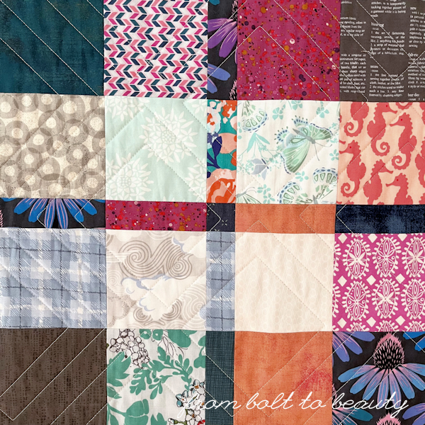
How to Assemble a Plaid-ish Pull / Beauties Pageant 126

Last spring, I participated in a big scrap overhaul hosted by FeelGood Fibers. I decided it would be easier to organize a smaller, less-daunting pile of fabric, so I started the process by pulling bits for a project or two.

One of those projects was Plaid-ish, a free pattern from Erica Jackman (Kitchen Table Quilting) that has been made by thousands of quilters. I highly recommend this pattern. Because Plaid-ish uses no background fabric, it’s a super-duper scrap buster!

I like to rein in my scrap quilts with a concrete palette, and I started my Plaid-ish pull with orphan charm and layer-cake squares in shades of salmon, periwinkle, and grassy green. (Kate Spain fans may notice bits of Canyon and Aria in the picture below; those prints set the stage here.) Then I found those same colors in different values. I added aquas but not teals, navies and grays but not blacks. 

Overall, the quilt is built around low, medium, and high values. Each of my palette colors appear in at least two of those categories. I also made sure everything was on the modern end of the spectrum; none of my more vintage-like scraps, such as those from Denyse Schmidt, made it into the pull.

I can’t tell you how much fun this process was for me. I loved discovering bits in my bags and bags of scraps to include in this pull, and when I exhausted the possibilities in my scrap bin, I moved on to my stash. A few fat quarters that were hard to use in other projects worked well here. I like when some prints appear throughout a scrap quilt—I think it adds unity to the project—so those fat quarters served an important purpose.

I’m looking forward to quilting this beauty. She’s low on the priority list, though, so I’m not sure when that will happen. You’ll be the first to know when it does, though!

After I assembled this fabric pull, I did overhaul my scrap storage entirely. I cut a lot of pieces into 2.5-inch squares for future scrap quilts. Believe it or not, what remained fit nicely and neatly in one drawer! The time and effort that I devoted to this project were well spent. (However, I could have done without the mild case of tendonitis I got from using my rotary blade so much. Ha!)

If you’ve made a Plaid-ish quilt, I’d love to see it. Please upload it to this week’s linky along with any recent finishes. Thanks! And have a great weekend, everyone!

Follow Me On ...


* * *


The pageant rules are simple:
  • Post your finish in the linky tool. (No links to your own giveaway or linky, please!)
  • Point your readers back here with a text link or use the button above.
  • Visit and comment on other participants’ finishes.
You are invited to the Inlinkz link party!

Click here to enter