Wednesday, May 31, 2017

Instagram Is Messing with My Head

When it comes to social media, my platforms of choice are this blog and Instagram. The beauty of blogging is that I can go into detail about my quilt-making experiences, perhaps encourage someone to try a new technique, and assemble an online journal of my projects over the years. Blogging takes time, though, and the writing and the photography cut into my sewing time.


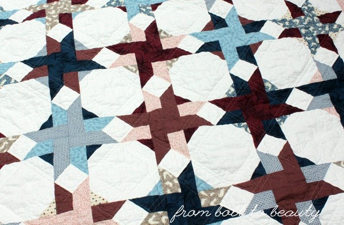
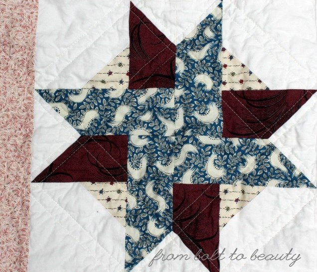
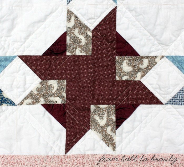
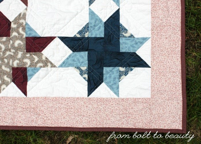
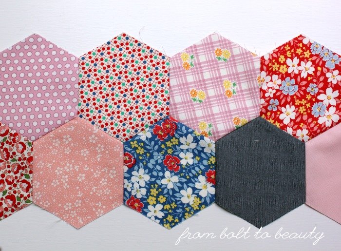
Here are some in-progress shots that I haven’t posted on Instagram.
I’m piecing these hexagons by machine.

Instagram is a nice alternative. Its emphasis on pictures is particularly appropriate for the quilting community, and I like to see what everyone else is working on and to get feedback on projects of my own. Unfortunately, I think Instagram is doing me more harm than good these days. I post sparingly—just once a week or so—but I always keep up with the posts of the 200-plus people I follow. What’s the problem with that?

It’s affecting my creativity. I am consuming every day, often multiple times a day, on Instagram. It keeps me informed, but I think it’s undermining my creativity. I need to stop processing what everyone else is doing and to focus on my own projects. If I need inspiration, it’s better to page through an art book, take a walk in my little New England town—pretty much do anything other than look at quilts!

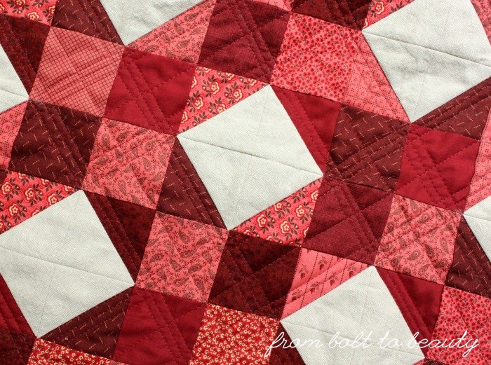
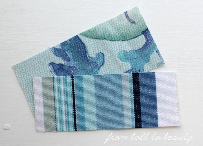
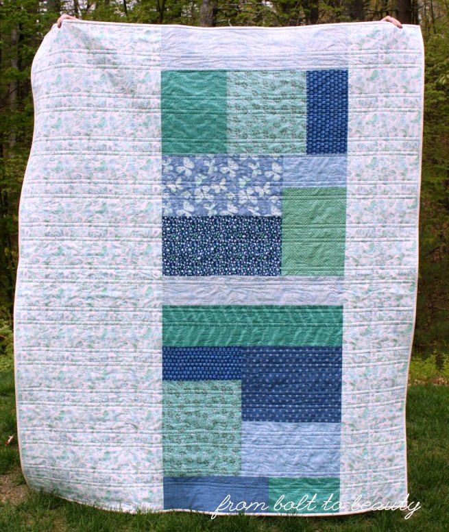
I’m making this runner, from French General fabric, for my dining room.

It has me trying to keep up with my cohort. I can’t help but compare what others are creating, achieving, and finishing on Instagram to my own projects. And all that comparing is giving me a bad case of the I-shoulds: I should be publishing my own patterns! I should be monetizing my hobby! I should be [fill in the blank]! The I-shoulds never serve me well. I need to focus on what I want to do and how I want to spend my time.

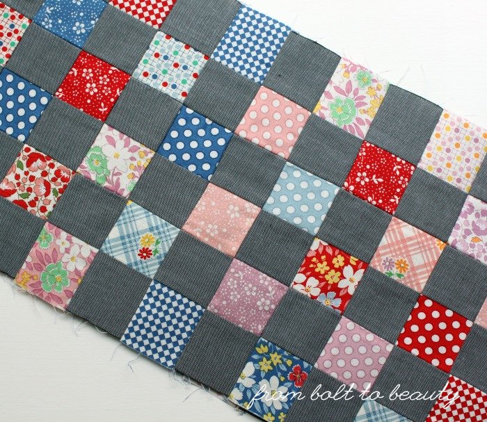
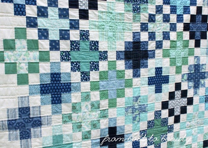
My dedication to using all my scraps is evident in this patchwork,
whose squares finish at an inch and a half.

Bottom line: This is a better space for me, and I’m going to focus more on my blog and reading others’ blogs. I won’t disappear from Instagram, but if I’ve connected with you on that platform, I won’t be as in the loop as I have been in the past. Forgive the dearth of likes and comments!

Is any of this resonating with you?  How do you keep your own involvement with social media in check?

Follow on Bloglovin

Friday, May 26, 2017

My Easy-Breezy Beach Quilt

Mother’s Day 2017 was the kick-in-the-pants deadline I needed to finish two quilts. The first went to my mom. For that, I used a jelly roll I had on hand in colors I know she likes. The second went to my mother-in-law and was designed to coordinate with the living room in her new beach house.

I found the inspiration for the design on Cindy Lammon’s Instagram feed. (Check out the quilt here and here.) Cindy’s use of a dotted chambray as the background fabric was, I think, brilliant. I initially wanted to replicate it, but based on the fabric swatches my MIL provided me and the selections in my fabric stash, I went in a different direction.


Instead of going with a dark background, I went with my beloved Kona Snow. I pilfered some 10-inch squares from an Aria layer cake, by Kate Spain, that I had on hand and fleshed the fabric pull out with selections from my stash and yardage I bought specifically for the project. The result is light and airy—perfect for a beach house!


I even bound the quilt in Kona Snow. Considering the amount of color already in the quilt, the blue or green bindings I tried looked gaudy. A light binding might not be the most practical option, but it reinforced the easy-breezy feel of the project.


The biggest lesson I took from making this quilt was the importance of homing in on a palette. At first I thought I would use the blues—all the blues!—from my stash. Once I had a few blocks sewn, however, I realized that I needed to focus on a few select colors. Using my cut-up Kona color card, I decided that Aqua, Navy, Bahama Blue, Aloe, and Cadet were my priority for the quilt ...


I was pretty proud of myself for breaking into a beautiful layer cake for the sake of this quilt. Usually, I keep my precuts together and use them—whether they’re charm packs, jelly rolls, or layer cakes—in a single project. It was worth it here, however, and I still have probably thirty 10-inch squares of Aria to use in future quilts.

What do you have to say about that? If you’re a precut buyer, are you diligent about using a precut in just one project? Or do you throw caution to the wind and use some of a pack here and there?

Linking up to Finish It Up Friday and Let’s Bee Social ...

Follow on Bloglovin

Tuesday, May 16, 2017

Five Weeks and Counting

Dear readers, as I write this, I am a whirlwind of quilt-making activity. My boys have five more (short! precious!) weeks of school before summer vacation starts, and I am doing everything I can to be productive before we slip into our summer schedule. I have three finishes to share with you in the next week or two, and then I’ll be starting something new. : )

My first finish is this, a throw-size quilt for my mother for her (belated) birthday/Mother’s Day. It might also cover last Christmas—I can’t remember. When it takes 20 to 40 hours to make a present for someone, I think it should count for multiple gift-giving holidays!


This quilt was a long time in the making. It wasn’t complicated—actually, the block design, by Patch the Giraffe, is straight-forward. What was difficult to work with was the fabric. I used a jelly roll of the Lady Mary collection from Andover’s Downton Abbey line. The fabrics themselves are lovely, but they don’t work well together as a collection. There is no clear focal fabric, no design to anchor the group. And although armed with a few dozen 2½-inch strips of these fabrics, I didn’t have enough variety to make an interesting quilt. My solution was to buy more fabric, almost exclusively from other Downton collections, to try to make it work.

I started working with the burgundy, dark blues, and tan from the original jelly roll.


I omitted a few fabrics with cream backgrounds because they didn’t create enough contrast with the Kona Snow I used. The cream background below is the exception. In addition to burgundy and dark blue dots, it contains some purple ones, which helped me expand my palette and add some different fabrics to the mix.


These traditional dots, surrounded by purple, are not from the Downton Abbey line. They’re sweet, though, and worked well with the other designs ...


The top needed a little something else, so I added a swath of pink in the border and bound the project in the purple dot.


The result may not be a “Michelle quilt,” but I think it’s a good stab at “a Mom quilt made by Michelle.”

The funny thing is, my mom is a quilter. I’ve made a handful of quilts for other quilters (like this one and this one). After all, who could appreciate the time and effort I put into a project more than another quilter?

What’s your take on making quilts for quilters? Have you given one of your creations to someone who could have made it for him- or herself?

Linking up to Let’s Bee Social, Needle and Thread Thursday, and Finish It Up Friday ...

Follow on Bloglovin