 |
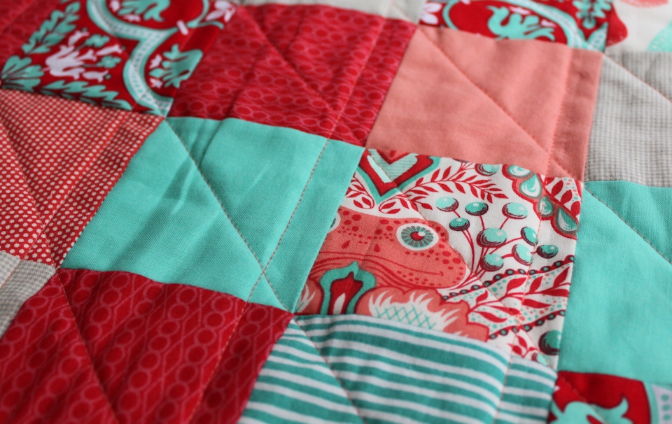
| Watermelon Patchwork: The front |
It started as part of my purge effort, prompted by Stitched in Color’s exhortation to use up our neglected fabric, the stuff we’ve had for way too long. And the parameters I set up were significant: make a quilt with that fabric, buying as little yardage as I could to finish it up.
I had Lotta Jansdotter’s teal stripes, Joel Dewberry’s intricate Historic Tile in tomato and teal, Bonnie and Camille’s coral dots, the tiny gray checks, lots (lots!) of Kona Salmon, and scrapage from Denyse Schmidt and Tula Pink. I bought a little Bella Solids in Bermuda, some of Lizzy House’s Jewels in poppy, and lots (lots!) of Kona Cardinal.
 |
| A tiny bit of Tula |
I went far with the purge part of the project, using up bobbins in blues and reds while piecing the patchwork. I even used Aurafil 4250 (flamingo variegated) because I have an obscene amount of it. (Do you ever buy something at one store because it’s easier—and probably cheaper—than driving to a second store to purchase a smaller amount or less expensive version? That’s my Aurafil 4250. If you need any, let me know. I suspect I’ll be using it for the next decade or so.)
 |
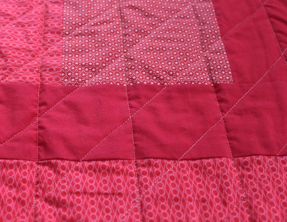
| Lizzy House, Kona Cardinal, and a small geometric from Clothworks |
The jury of one has reached a decision: I like this quilt. Admittedly, it’s very un-Michelle. It’s bright! There’s almost no white on this quilt! And it’s bright!
But if given the same constraints, I’d probably produce something comparable to what you see here. My only regret is the uneven border on the front. It drives me a little batty.
 |
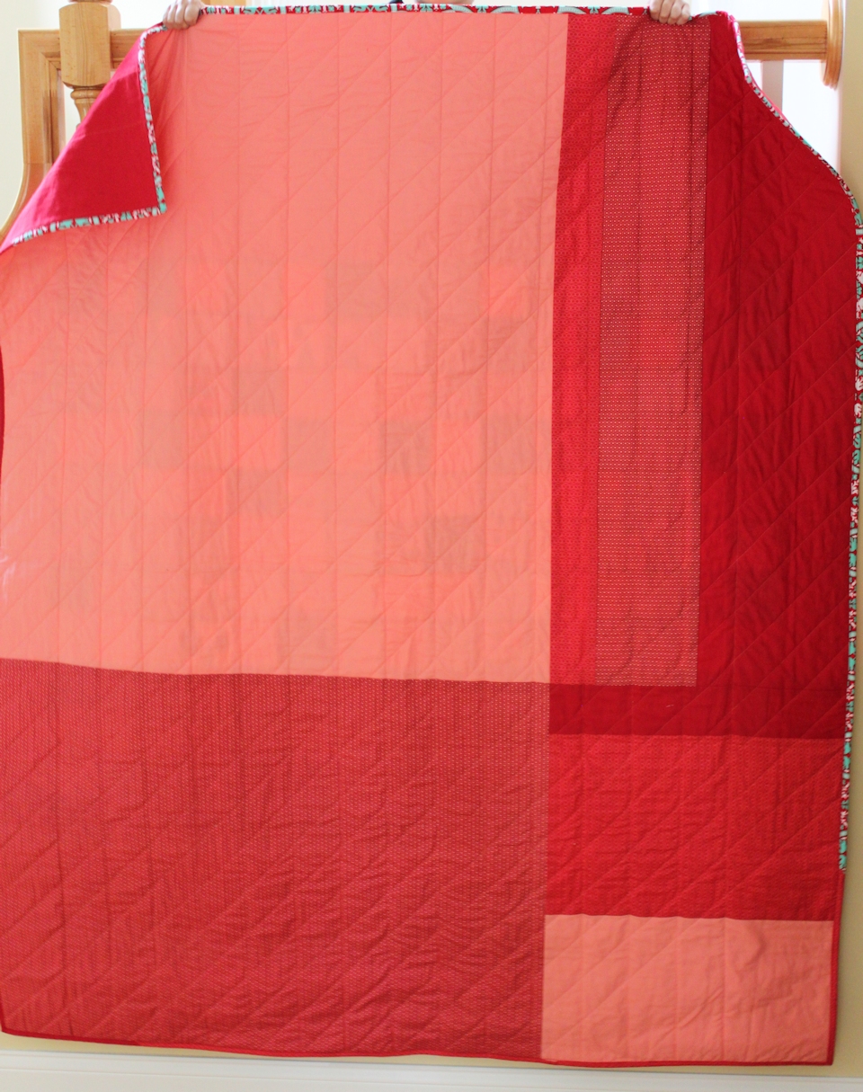
| Watermelon Patchwork: The back |
The most fun part of the process, however, was knowing that this was headed to a charity: Margaret’s Hope Chest. Earlier in the summer, Amanda Jean rallied readers to make quilts for this organization. I couldn’t commit to a quilt back then, but I still wanted to contribute after the fact. Making a quilt for charity made me happy. As I vacillated about whether I liked this quilt—whether it reflected my personal aesthetic in quilts—I knew that it would find its way into just the right hands. Someone is going to receive this quilt and think, “Wow. This is so me.”
And that’s pretty cool.
 |
| This is what happens when you employ the services of a five-year-old to hold your quilt. Fear not: no quilts were harmed in this photo shoot. |
Linking up to Let’s Bee Social, Needle and Thread Thursday, TGIFF at Quilt Matters, and Finish It Up Friday ...

This is so pretty!
ReplyDeleteI love this quilt. I'm sure the recipient will love it as well. I like bright!
ReplyDeleteOh, it's so happy!!! I love it!
ReplyDeleteWhats not to like! I think its pretty
ReplyDeleteI am not normally a lover of red but when mixed with teal - I think it is a winning combination - I think your quilt is beautiful! I just know it is going to make someone's day/week/year :)
ReplyDeleteBTW, that last picture is awesome!
It's pretty amazing that your five year old held the quilt as long as he did Michelle... did you use bribery? LOL I actually really love reds mixed with shades of aquas or teals. This quilt probably just isn't what you are used to loving, but it is very cheerful and pretty!
ReplyDeleteLove it! The colors, the child labor, the improv back especially! I'm sure the lucky recipient will be very happy!
ReplyDeleteI also like this quilt. I love the color scheme and the bold bright fabrics.
ReplyDeleteI really like what you did with the piecing on the front and how you purged the back fabrics, very creative! Glad this quilt wan't harmed in the photographing process and it's off to a good charity! Oh, and of course it looked awesome in person :)
ReplyDeleteBright, bold and beautiful! Great colour choices, Michelle, and I love that back too. Congrats on a beautiful finish!
ReplyDeleteWhat a great quilt, defintiely my sort of colours in the mix and I am sure that it will be delightfully received by someone. Congrats on a really great finish.
ReplyDeleteLooks to me like your scraps were meant to be together - love the teal and red... even without our beloved white in there!
ReplyDeleteRed and aqua is a favourite ; )
ReplyDeleteI am the "watermelon diva" and it's freeking awesome! Now if it doesn't freeze tonight -- I just might have a watermelon crop!
ReplyDeleteLove it!
I love it. Teal and red is so striking together.
ReplyDeleteI LOVE the color combination for this quilt!!! The red and aqua work SO well together. I also really love your quilt back! I'm typically not a huge fan of piecemeal pieced backings, but yours is so smooth and aesthetically pleasing. I love it!
ReplyDeleteWhat a well written post - a pleasure to read. Congratulations on a bright finish and for such a worthy cause! Well done, Michelle! PS. That last photo is priceless! Your helper deserves some cake!
ReplyDeleteI really like the quilt and I love hearing about your progress. Congrats on a great finish.
ReplyDelete