
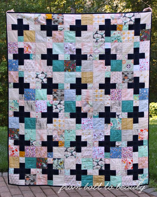
My Ode to Art Gallery quilt, first written about here, is done. In typical Michelle fashion, I pieced a mostly monochromatic backing, in shades of teal. (I also did that here and here.) And then, predictable again, I followed certain seam lines to create a simple allover quilting pattern. Finally, I bound the project in the same Kona Nautical used for the pluses, and—ta da!—I have another finished quilt!
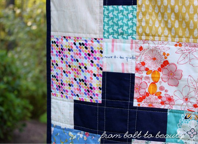
OK, now for some pictures. First, the front (if you’re wondering how I developed this palette, check out my previous post about the subject) ...
And the back, in all of its teal-hued glory ...
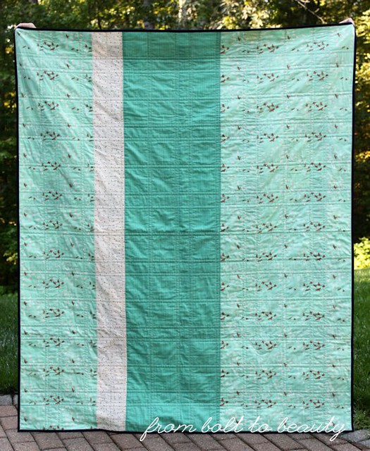
You can’t tell from the above picture, but the deeper teal fabric is from Anna Marie Horner’s Loominous line. I got it in a scrap bag (there were many one-yard-plus cuts in that “scrap” bag!), and it’s really not my thing, at least not for a quilt front. But it works well here, as the star of the back.
Are you an Art Gallery fan, too? Who’s your favorite AG designer, or what is your favorite AG collection? Let’s gush about the fabric manufacturer that invites us to “Feel the Difference” in the comments!
(BTW: I think my favorite line is Bonnie Christine’s Sweet as Honey. Both palettes are sooo pretty, and I have eyes for the deer and bird and bee fabrics! The ridiculous thing is, although I have plenty of Bonnie’s fabric, I don’t have any from Sweet as Honey. True story!)
Linking up to Needle and Thread Thursday and Finish It Up Friday ...

Really nice. The pluses stand out. And great colour on the back.
ReplyDeleteYou know I love a good plus sign quilt :) This quilt is beautiful.
ReplyDeleteThat's a great palette and a wonderful finish. What I find interesting about the AG fabrics is that, while I don't often buy the kinds of fabrics they make, the designs I mean, there is at least one in every collection that fits into my Civil War era fabrics. Sometimes it's a shirting look-alike. In the collection you highlighted, it's the beautiful golden bed of daisies. I do occasionally like one of the others and stash it away, too, when I can find it at a shop. Bonnie is especially good at that.
ReplyDeleteThe navy binding really frames it in nicely, and the backing is lovely!
ReplyDeleteThis quilt just makes you feel good with all of the different fabrics and the great calm color palette. I love how the navy binding brings it all together. Great finish! Love that Sweet as Honey also, it's a great line, you're right. Great 'scraps' in that scrap bag, lucky you.
ReplyDeleteWhat a great quilt. Much as I like AG fabrics, I think this is truly a case of the whole is greater than the sum of the parts. Well done!
ReplyDeleteLove this. Your plus signs really pop and the navy binding frames the quilt nicely!
ReplyDeleteMichelle this is gorgeous!! I love the dark plus' and how they stand out! And I know I haven't said this before...but I LOVE your blog header!!
ReplyDeleteI love plus quilts and this is another beauty. I really like the multi fabric background.
ReplyDeleteLove the use of color in this quilt.
ReplyDeleteIt's beautiful - what a great way to use your favourites.
ReplyDeleteHallo, toller Blog, gefällt mir!
ReplyDeleteSchöne Grüße
Stefficel
Beauty&Kosmetik