
I’ve been meaning to make an AG-only quilt for a while, something that would be a sort of cross-section of the company’s fabric lines. My friend Kim made a plus quilt back in 2015, using some AG charms from a swap I helped organize, and I loved it.
I had charms from the same swap, some scrappy bits from projects past (like this one and this one), and some yardage that I could play with. Almost all of it went into my quilt top.
Here is the finished flimsy, my first of summer 2017 ...
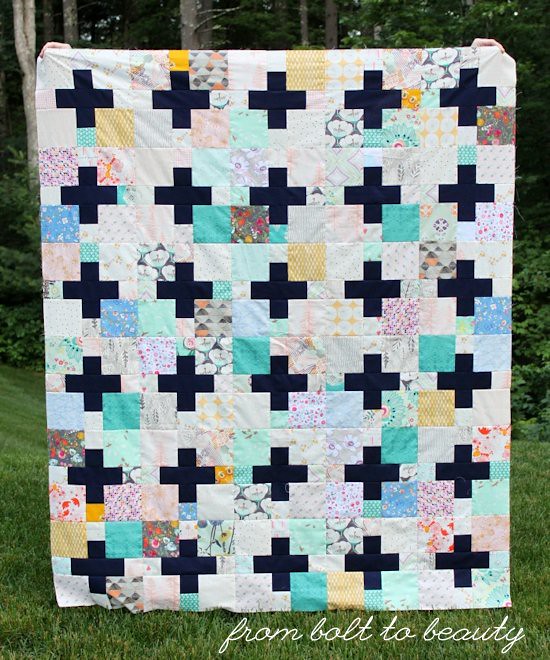
I’m pretty excited about the results. The quilt includes a lot of disparate fabric lines and colors, but I think it works. What follows is how I approached thinking about the fabric pull and the design.
Developing a Cohesive Palette
As I culled through the AG fabrics I had on hand—from tiny trimmings in my scrap bin to the large cuts in my stash—I noted the recurring colors. In particular, there were off-greens like teal and mint, mustard, grey, all shades of pink, and blues that bordered on periwinkle. Those colors were my lowest-common denominators, and I used them to judge whether fabrics made it into the quilt. That’s not to say that other colors were avoided; a particular fabric needed to contain some aspect of that palette.
This palette got me thinking. AG fabrics play so nicely together. They don’t coordinate color-wise like Cotton and Steel fabrics do, across designers and collections, but there is a modernness to AG’s color selections that is evident in its many fabric lines. This is a contrast to other manufacturers whose fabrics I buy. Take Moda, for example. There’s no common palette in its fabric collections, even those I consider to be more modern. Sure, it’s easy to spot a Bonnie and Camille palette or French General palette, but Bonnie and Camille fabrics do not play well with French General fabrics. This is not an earth-shattering revelation, just an observation of how different fabric manufacturers use color. : )
Establishing an Overarching Design
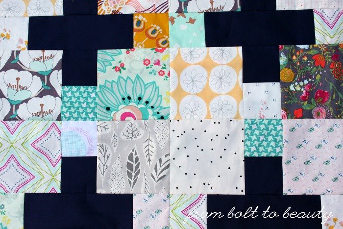
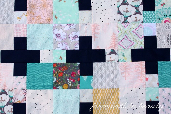
In my mind, this project is not a scrappy quilt—a fraction of the fabrics came from my scrap bin—but I found myself implementing the same strategy I would to make a scrappy quilt. I like to use a strong, predictable design when I’m sewing something scrappy, and the plus blocks here do the job well. (For the plus block pattern, see the image at the bottom of this page. Other scrappy quilts of my include Obsession and Good Day Sunshine.)
And I like to repeat certain fabrics—I’m convinced that simply using some fabrics again and again creates cohesion. That’s where my yardage came into play. Some fabrics are used for a just a block or two because that’s all I had in my scrap bin. When I had yardage that played into the palette I developed, I used those prints throughout the quilt top.
Using the Power of a “Bridge Color”
At QuiltCon 2017, in Savannah, I attended Tara Faughnan’s Playing with Solids workshop. This class promised to push us participants out of our color comfort zones. During our three hours together, Tara encouraged us to minimize unnecessary chatter and rely on our own instincts to develop two-color combinations quickly, without overthinking.
During this class, she mentioned what she called “bridge colors.” These colors—including hues like mustard, navy, and olive green—are super versatile. Using them can bring harmony to what may otherwise seem like a visual cacophony. (That’s my definition of the concept. I didn’t think to jot down many notes during the class!) Bridge colors are apparent in Tara’s recent finishes (see here), and I’d argue that my use of navy in the AG quilt works as a bridge color, creating cohesion between the main color palette and all the other colors that make an appearance.
The concept of bridge colors reminds me of articles I’ve read about—would you believe it?—bridesmaid dresses. I have worn my share of unflattering bridesmaid dresses, but some wedding-planning authorities encourage brides to dress their entourage in a color like navy, plum, or wine. Could those options be considered bridge colors because they work with most hair and skin colors?
Why do these bridge colors work in such different contexts? Could it be that they’re not straight-on blue, purple, and red but colors that have a depth and complexity? I’m not sure. It’s interesting, though, and I’ll be more mindful of my use of these colors in future quilts, for sure.
So do you think this quilt top works? Does any of my rationale ring true with you? Do you find yourself approaching projects of your own in a comparable way?
Linking up to Needle and Thread Thursday, Finish It Up Friday, and Let’s Bee Social ...

I think this quilt is gorgeous!!! I've always thought of "bridge colors" as just being man clothing colors. Think about it -- all men's shirts come in navy, mustard, evergreen, dark red, maybe a bright orange or green once in awhile, but mostly dark, rich, background colors. Or maybe that's just my husband's wardrobe. :)
ReplyDeleteAnd this is definitely scrappy. To me, scrappy doesn't have to mean it all came out of the scrap bin(s), but that you've used more than X number of fabrics. X will vary depending on the quilter, but for me, it's generally between 6 and 10. Also, you have to keep in mind that what I call a scrap, you might call yardage, and someone else might call pointless. :D
Great finish! And discussion. :D
Ha! Thanks for the kind words about my quilt and the early-morning laugh (I needed it!). Yes, scrappy to me isn't necessarily scrappy to you. And neither of those aren't the scrappy quilts that quilters of yore sewed up -- using every bit of fabric they had on hand (cigar bands? yes, put them in the quilt!).
DeleteBTW: Looking forward to growing my stash with you soon. Keepsake, here we come!
You hit some interesting points about AG's lines playing together well. Wonder if that is intentional, if they speak to designers about what others are doing? Or just encourage certain colors to play well together? Sorry lots of questions on the design side.
ReplyDeleteIt looks scrappy and cohesive. Also the plus reads almost black to me and really stands out.
I started thinking about the colors AG uses when I noticed that I had almost no grassy greens in my vast array of AG fabrics -- all the greens were mints and teals. I would bet it's intentional. I think the company looks to produce fabrics whose fresh palettes match the modernity of the designs themselves.
DeleteI love using navy blue solid. I've got a few recent finishes and an in process piece using it. One of these days I'll be making a plus quilt of some sort but haven't gotten far enough to figure out which one or pull colors...
ReplyDeleteOh, I love reading color theory posts! I was just having a conversation with a blog buddy of mine about scrap quilts and how you really do have to have some sort of color plan. It's not as easy as it looks. You can't just throw any scraps willy nilly into a bag and expect it to come out beautiful. I am just now beginning to realize this about scrap quilts. Really enjoyed this article!
ReplyDeleteI agree - it works! It's very attractive and a wonderful summer top.
ReplyDeleteHi Michelle,
ReplyDeleteI love this quilt in all its scrappy glory. I love the navy theme running throughout, and fell that all it is great to use scraps that tell your story it is nice to have one solid beam, as it were, to support all the fun. Sort of like the framing of the house behind all the prettiness. ~smile~ Roseanne
I think this quilt works beautifully. I think it has a mostly cool color palette with small bursts of mustard for a warm touch. The navy does ground the quilt, and with it also being a solid it helps the eyes and mind know there are resting places. I am fascinated by your thoughts on the grounding colors and how they work for bridesmaid dresses. Some great food for thought here!
ReplyDeleteFabric choices work wonderfully together! Beautiful!
ReplyDeleteYes this quilt works and I think it's the repeating greens that do it. I see a lot of scrappy quilts that I don't like and I think it's because they don't have any cohesion to them and this quilt is a good example of how to do scrappy but unify it.
ReplyDeleteI think I wanted to get into that class but unfortunately it was full.