
I’ve been meaning to make a Bonnie and Camille quilt of epic proportions, and I’ve wanted to make an Amy Butler quilt of similar epic-ness. My thought was that these quilts-to-be would be a spectacular cross-section of those designers’ work, and I would keep either project for me, me, me! Maybe this was the pattern I’ve been waiting for?
Those designer-specific quilts would require buying fabric—perhaps a lot of fabric. Then I realized I had the necessary fabric on hand already: my 40-fat quarter bundle of Basic Grey’s Mon Ami. I wouldn’t do a designer-specific quilt; I’d home in on one gorgeous fabric line by one of my favorite design houses!
Using Kona Snow as the outline for each of the pluses, I started cutting and sewing. My goal is a throw-size quilt, requiring 30 blocks. I have 20 done, 10 more to go. Yes, this quilt is for me, me, me!
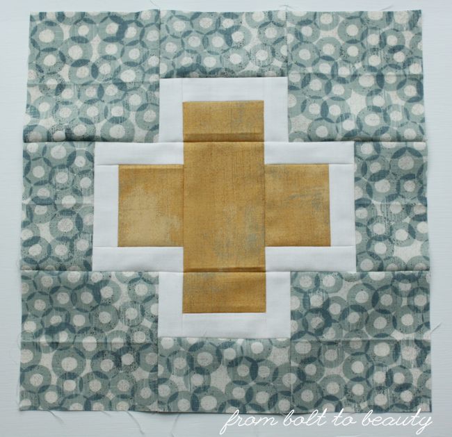 |
| This is my favorite block. I love the combination of blue and yellow. |
 |
| The grays in this block make me pretty happy, too. |
As I’m taking stock of this work in progress, two thoughts come to mind. First, I really love the combinations of fabrics in shades of blue, gray, yellow, and red. I’m not feeling the green as much. What do you think? Should I omit the green fabrics? I would have to remake four blocks.
 |
| Here is the version with greens. |
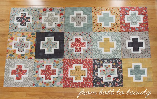 |
| And here is the non-green version. I think this is the winner, friends! |
Second, this is an unusual project for me to sew. My quilty brain doesn’t think in terms of making one complex block (as opposed to, say, a half-square triangle block) and repeating it over and over again in a standard grid. There’s beauty in it, to be sure—I’ve gotten good at churning out these 12-inch blocks, and I find some peace in the repetition. I can think of only two other quilts like this that I’ve made: my Lotus Blossom Quilt and my Dogwood Blossom Quilt. I guess I’m the non-block quilt maker. It seems like a bizarre observation to make, but it’s true for me and the quilts I tend to be drawn to.
Now it’s your turn to chime in. Do you have any thoughts about the green-fabric issue? What generalizations can you make about your own quilt projects? Is it a palette that you tend to gravitate toward? Do you have a propensity for a particular design or technique? Let the rest of us know in the comments.
Linking up to Let’s Bee Social, WIP Wednesday, and Needle and Thread Thursday ...

I, personally, like the green. It gives the quilt a little oomph. And being a rebel, I'd totally make the next few blocks with kona snow in the background and a print as the outline... but I'm rebellious. :D It is a great use of Mon Ami though... :D
ReplyDeleteYou read my mind, my friend! I have the Mon Ami prints with white backgrounds. I was thinking of incorporating some of those and using the light gray Grunge print as the outline. : )
DeleteMy vote is to go greenless. There is just something about sticking with primary colours.
ReplyDeleteI like the green.
ReplyDeleteWithout the green would be my vote. Especially if you only need to remake four blocks, and then stitch them before it all gets sewen together. Of course, you can use the green blocks in your backing so they won't be wasted.
ReplyDeleteHappy sewing!!
I like both ways, the green definitely changes the look of the quilt. I think my favorite is without, it kind of makes the yellow more of the star of the colors.
ReplyDeleteI think I like the look of it without the green blocks but I'm sure you can always use them in another project or on the back. The 2 blocks with the really dark gray really stand out to me - with all the other colors so I would concentrate on where best to place them for the visual look you want.
ReplyDeleteI say either add MORE green to balance it out in feel or leave it out... but I'm leaning toward leaving them out. Good luck choosing!
ReplyDeleteI like both versions, but the more I look at them, I say leave out the green. If you're not feeling the green, now is the time to make the decision when you only have a few to remake.
ReplyDeleteI say go green less. The colors without green are the ones of their pb&j lines- one of my first favorites. Looking for a project for mon ami but the white outline looks intimidating?
ReplyDeleteI agree greenless for me but I find strange things happen when I've done an entire quilt and laid it all out. Sometimes it's lacking something and perhaps those 2 blocks with just the green cross just might add a touch of contrast.
ReplyDeleteLike you I'm not normally a complex block person but when a design grabs you it grabs you and this is a lovely new version of a plus quilt.
Personally, I like both versions, but if you do not 'feel' the green, I think you should omit them. I think the version with the green leans towards a fuller coverage of primary/secondary colors (which you might consider boring), while the one without the green is more 'complex'. Do you get what I mean or does this sound as if I overthought this too much?! I really believe you should go with how you feel. It is your quilt so feeling great about it is a big plus (no pun intended)! Good luck with choosing and thank you for sharing your versions. I love how a different line of fabrics is able to change the look of a block completely!
ReplyDeleteThose green blocks look right at home in the mix, I think. And your blocks look fabulous! The prints are so pretty and you have come up with some beautiful combinations.
ReplyDeleteI thought the green looked good until I saw the picture where you pulled them out and I think that looks better.
ReplyDeleteAlmost everything I make is blue.
Personally I think that the green adds a nice pop and conrtrast that the quilt needs... but then again, I'm totally a green girl (not to mention BG girl)
ReplyDeleteI tend to gravitate towards pinks in greens in quilts, but perhaps not in the classic sense. Funny thing is that I like to wear purple, decorate with orange, and sew with pink and green... looks like no rhyme or reason there. I love freezer paper applique and paper piecing, but something like needle turn drives me nuts... no rhyme or reason there either.
Good like with your quilt... love the pluses with these fabrics!
I think the green in there gives it a little more pop of color, I like it. Either way it is going to be a gorgeous quilt.
ReplyDeleteThis is beautiful. I would keep the green. It adds a lot to the quilt. I get bored making a lot of repetitive blocks, but I really like the look of quilts that have a lot of repeats like this one. I am pretty sure I will start a quilt this year with lots of repetitive blocks. Just have to figure out what I want to repeat - pluses, snowman, birds, etc.
ReplyDeleteAlthough I never analyzed it before, I also tend to be a non-block quilter! I think it's because blocks tend to be more tedious to create. I need more instant gratification with quicker finishes. When I look at my WIPs, many of them are block quilts, which I tend to let languish because they take too long, causing me to lose interest.
ReplyDeleteI'm not the only one! For me, I start with the big picture of a quilt and how I want it to look overall. Using blocks to build a quilt is just the opposite -- looking at the micro view and expanding from there.
DeleteI like the greens and as mentioned earlier maybe even put a bit more green into the mix!!!! I love the block ..... yet another to add to my never ending list!
ReplyDeleteThis is going to be pretty! I love your fabric choices and it's awesome to make something for yourself. I'm doing the same thing with Cheryl's Midnight Mystery quilt. :)
ReplyDeleteI actually kind of like the green but when I look at the picture without the greens I'm ALMOST swayed. I say, trust your gut and do what your instincts tell you cause it's going to look glorious either way but you know better than to ignore your feeling on this ;)
ReplyDeleteThe green pops and looks like a lot of fun. The primary color scheme is really soothing though. It depends on your mood, I guess. You can't go wrong. Me? I think I'd like something soothing right about now. I vote primary.
ReplyDeleteI like it better without the green - although my taste leans toward avoiding too many colors. Either way it's going to be fabulous!
ReplyDeleteSo according to the comments you have a 50/50 tie here! I say go greenless, I like them for the pluses but not the background. I totally gravitate away from green colors, mint yes, teal yes, chartreuse yes, true green no. I guess I gravitate away from the basic 8 Crayola colors.
ReplyDeleteIt's funny. I agree the green is not necessarily working. But without the green it feels like it is missing something. . . I know you are working with a specific fabric line -- so you might not want to mix something else in. But I actually think it might look pretty to add something in that picks up the deeper blues in the line (like the blue that makes a star shape in the fleur pattern). I'm curious to see what you'll decide! Either way, it looks very pretty, and it's going to be a great quilt!
ReplyDeleteI think the green adds something to the mix and I would probably keep it. Without the green the top feels a little generic. That being said, a top totally changes once it's quilted so maybe that's all it needs. If the green isn't working for you is there another darkish color you could add in its place? I love Basic Grey and this quilt will be gorgeous no matter what you decide!
ReplyDeleteDrop the green. I find the quilt more cohesive without it. And your instinct is to drop the green--that's what your gut is telling you.
ReplyDeleteI don't hate it with the green--just think the quilt works better without it.
To me the green gives it a pop, but I also understand how pleasing without it is too. I might be biased as green is one of my favorite colors. I love the block you are making! As for generalizations about my quilting, I'm still learning and growing in my quilting, such as following a pattern, even though I have been quilting for a while, that I'm not sure yet as to the answer on that question. I feel like I am open to experimenting and exploring everything that is out here in the quilty world.
ReplyDeleteI like it both ways, but since the quilt is for you I would take it out to get the look you want. The color scheme is more ordered without the green, the green makes it look more scrappy. Love the Basic Grey as usual!
ReplyDeletethis is a beautiful quilt and a great use of that FQ bundle.
ReplyDelete:) Kelly @ My Quilt Infatuation
Personally I like the green, but this is your quilt! It should be exactly whatever warms your heart, and your heart is saying "No green" so I'd go with that.
ReplyDeleteI like the green, but as it is your quilt, you have to chose what works for you.
ReplyDeleteI like repeated block quilts. I like their repetition and symmetry and have made many, but not so many recently. I need to get back to that.
Both versions work very well. Sometimes it's hard to edit out blocks that have already been sewn, but I think it's sometimes important in the process to find something that works best for us. :-)
ReplyDeleteOne of the most popular memes today is the comic-like images which are mostly funny. me me me
ReplyDelete