
Maybe this phenomenon isn’t unusual. Perhaps you have a set of colors you consistently prefer over others. Here’s where the weirdness starts: My mom also likes red, green, and blue. Her house is decorated in a dusty pink, greens on the continuum of sage to sea foam, and Williamsburg blue.
And now it gets weirder. My 6-year-old likes the same three colors. When he was just 18 months old and faced with a pile of colored blocks, he would separate the red, green, and blue blocks from the others. In fact, we found collections of all sorts of red, green, and blue objects squirreled away around our house. He so consistently preferred those colors that I made the cupcakes for his second birthday with layers of red, green, and blue batter.
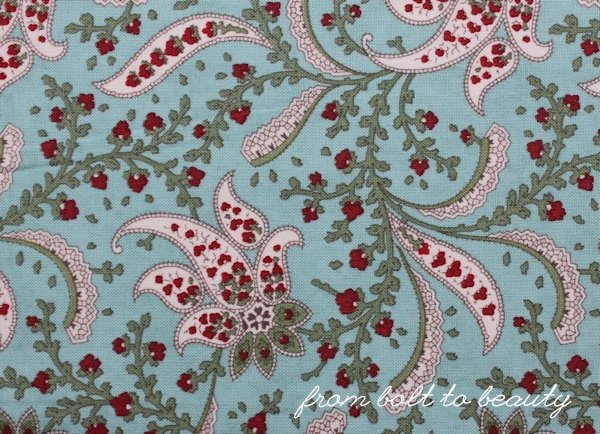
My stash reflects my fondness for this color palette. I’ve had one special fat quarter stashed away for many years, waiting for the right project. It’s an old print from Maison de Noel by 3 Sisters, and it appeals to my more traditional side. It’s a sweet paisley, but I know I likely wouldn’t have bought it in a different colorway.
I finally cut into this fat quarter for my latest finish, an orange peel pillow ...

If I had to summarize this project in a single word, it would be fiddly. With this Curves Class assignment moreso than the others I’ve finished (including this journal, this mini, and these potholders), I unpicked seams and at times scrapped an entire quadrant to start afresh with newly cut fabric.
Despite the failed attempts, I’m happy with the results, and it’s satisfying to step by and bask in the glow of a few nicely pieced curves. I like squares, rectangles, and triangles well enough, but the softness of these curves makes me want to sew more of them.
 |
| I paired 3 Sister’s Maison de Noel with Kona Snow and this off-red from French General. |
I didn’t think quilting—or maybe my quilting?!—would have added to this piece; I liked the clean look of the curves without quilting lines. To add substance without adding batting, I chose to interface it with Pellon Thermolam, which seemed to work well.
Curves classmates: I have one thought if you plan to sew this project. Do you remember Rachel’s original? (My apologies to other readers! I can’t find a public pic of Rachel’s pillow!) She cut all four main template pieces from a single square of fabric with a large-scale design. The result is amazing, but I chose a more forgiving nondirectional fabric. I actually made six quadrants and scrapped two wonky ones, but since I used a nondirectional, it didn’t matter which of the six I used in my final pillow.
I have two more projects for this Curves Class: my rainbow color wheel, which needs to be quilted and bound, and my Oodalolly (see Rachel’s original here), which is currently a heap of fabric. Stay tuned in the coming weeks for more on these projects.
Before I sign off, I wanted to send a shout-out to my fellow Curves classmate and all-around favorite quilty person. Kim Soper, the talented lady behind Leland Ave Studios, was not at QuiltCon last week, but her Long Island Modern Sampler was—and it won first place in the modern traditional category. To read more about this quilt and to learn where you can find the patterns for the individual blocks in it, visit Kim’s blog post on the subject.
 |
| Long Island Modern Sampler, courtesy of Leland Ave Studios |
Linking up to Sew Cute Tuesday, Let’s Bee Social, Needle and Thread Thursday, and TGIFF ...

I think that was the perfect way of using that fabric!!! It turned out really great Michelle!
ReplyDeleteYour curves look great! I love how you paired your print with the red, the color combo is beautiful.
ReplyDeleteColor combination is amazing and honestly I love your curves, I see nothing wrong with them! Just like Angela Walters stated: Don't compare! You're doing your best!
ReplyDeleteKim totally rocks! Love those curves. The fabric looks awesome with that solid!
ReplyDeleteI can imagine it was a finicky project! And if you had to pick stitches on those rounded edges, it probably stretched the fabric to the point it was better off recutting and starting fresh. I commend you for sticking with it, I think the finished pillow is fantastic! And beautifully sewn, as always. Thanks so much for the shout out! I'm living vicariously through my quilt, which has seen people and places I only dream of!
ReplyDeletewell done for finishing - it really looks perfect :-) I was going to quilt mine, but seeing the clean look of yours I think I am just going to interface too!
ReplyDeleteLook how fabulous you are! That looks perfect! And how happy that you got to use a special fabric. I love finding projects for special fabrics.
ReplyDeleteLove these curves, the white with the curves is so cloud-like that it makes the pillow looks extra light and fluffy. Your extra effort was worth it and it makes me feel better about struggling with curves this past week to know that in order to get something beautiful you need to make a bunch of mistakes.
ReplyDeleteKindred spirits. My whole house is shades of red, green and blue, with some goldish yellow thrown in. (It's fabulous for holiday decorating, too.) Your pieced curves are terrific! (And don't you love the word fiddly? I think it needs to become firmly entrenched in American English).
ReplyDeleteNice work on the pillow, love the layout and the contrast of red! It's going to look snazzy in your house.
ReplyDelete