Pages

Friday, October 27, 2023

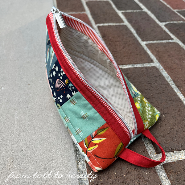
Triangle Pouch by Sew Lux / Beauties Pageant 234


It always feels good to end the week with a finish, even a pint-size one!

I’ve long admired the pouch and pillow patterns designed by Chrissy Lux, and I finally made time in my sewing schedule to try out her Triangle Pouch

This pattern is a great way to use up a lone mini-charm pack or, in my case, the remnants of a jelly roll.

I love how this project exudes personality both inside and out. The autumnal palette on the exterior opens up to a gray and cream dot on the interior that’s punctuated by contrasting binding strips. Because if you’re going to take the time to bind raw interior edges, you might as well give them a little oomph, right?

This may be my first Triangle Pouch, but it will not be my last! I have three additional striped zippers that are begging to be transformed into something special. With one Triangle Pouch under my belt, it’s easy to plot three more.

Should you want to make your own Triangle Pouch, you can find the pattern on the Sew Lux site and view the accompanying YouTube video here. The fabrics, alas, are all out of print: I used Songbook by Fancy That Design House for the exterior and a Swiss dot by Jen Kingwell for the interior. The super awesome zipper comes in tomato (pictured), as well as aqua and black, and can be purchased at Stitch Supply Co.

Follow Me On ...


* * *


The pageant rules are simple:
  • Post your finish in the linky tool. (No links to your own giveaway or linky, please!)
  • Point your readers back here with a text link or use the button above.
  • Visit and comment on other participants’ finishes.

You are invited to the Inlinkz link party!

Click here to enter

Friday, October 20, 2023

Silly Faux Roman Shades (That Took Years to Make) / Beauties Pageant 233


The usual quilting-related blog post is being preempted today by a rather annoying home dec project. The story is a boring one. The pictures? Not so great. But this has to be done! Because before this blog is a place to connect with other quilters, it is a personal journal of my sewing adventures, and it is better than any of my sewing notebooks, full of sketches and handwritten comments: I can’t misplace my blog, the posts are always legible, and I am able to search through my hundreds of past posts with ease.

Back in 2019—before Covid brought life to a standstill, before the cost of home improvement supplies soared through the roof—my husband and I redid our kitchen. The footprint worked well for us and went unchanged, but we retiled the floor, had the cabinets professionally refinished, and replaced all the appliances, which had already well outlived their projected lifespans.

As far as kitchen renos go, this one was substantial enough to disrupt our lives, and when we reached the fall of 2019, we had had enough. During the demo, we removed the window treatments throughout the first floor, figuring that we would deal with the dilemma in 2020.

None of us could have forecasted what 2020 had in store for the world, and needless to say, there was no sewing window treatments that year. Plus, my husband, boys, and I went months and months (and months!) without family or friends entering our house. Without the promise of visitors in the near future, and without the need for privacy in a house that’s surrounded by trees, the window-treatment project was not a priority. It was the albatross around my neck for years until, finally, I decided that 2023 was the year to address our bare windows.

Words of Wisdom 

Do you, too, have a curtain-less room?  Here are the words of wisdom I approach all window projects with ...

The only thing I hate more than sewing shades is paying someone else to make them. When you hire someone to make shades, the bulk of the bill is the labor, not the fabric. You can often make them for less yourself.

If you can get away with simple off-the-shelf drapery panels, however, buy them instead of sewing them yourself. First, you probably won’t save that much money making them yourself. Second, not sewing panels will free up your schedule for more quilting.

For my living and dining rooms, which function as one big room, I bought six drapery panels from Crate & Barrel. Four of those are used as curtains in the dining room. The remaining two I cut up and sewed into faux Roman shades for the living room. Using the same fabric creates cohesion between the rooms, and using panels in the dining room meant that I had to make three shades instead of five in those two rooms.

Don’t make functioning Roman shades when faux ones (that is, shades that do not raise and lower) will do. Regular Roman shades are more complicated to sew and require more fabric (and, therefore, more money). Originally, we had functioning shades in the kitchen, and they were not necessary. We never adjusted them.

If you have ridiculously large windows, look for home dec fabric that you looks good oriented lengthwise. Doing so will spare you from having to match repeats, which tends to be a cause of frustration and cursing for me. Because I used panels for the living and dining rooms window treatments, I didn’t have this luxury, but I used fabric length-wise throughout my kitchen.


Lessons Learned

The problem I have with window treatments is that I make them very infrequently yet expect my finished products to look professionally made. I know this isn’t reasonable, but it’s the truth. Here are some lessons I learned with my recent foray into home dec sewing ...

Your choice of lining matters. I mentioned that I cut up some panels for my living room. Instead of repurposing the lining from these panels, I bought a heavier product at my local big-box craft store because I think a substantial lining makes shades hang better. The problem was there was a difference in color. The panels had an ivory lining, and I bought a white lining for the coordinating shades. Sunlight makes the panels appear more ivory and the shades more off-white. (Did this mean I ripped the shades apart and remade them? Heck, no!)

Builders do not hang windows with your needs in mind. In my living room, the front two windows sit a little closer to the ceiling that the large picture window on the adjacent wall. I didn’t discover this issue until I had made all the shades the same length. My workaround was that the shade on the picture window has one fewer fold than the two smaller windows; that small tweak (unnoticeable to anyone but me) provided the extra length I needed.

Always buy extra fabric. Matching repeats (when I have to do it) requires extra fabric. So does centering a design on a shade, or in the case of my dinette area, aligning a design horizontally across adjacent windows.


Resources

There are bunches of places to buy fabric and window-related notions online. I bought my fabric here and my rings here. The YouTube videos I followed to make faux Roman shades can be found here and here.

If you have window treatments on your to-do list, godspeed to you!

Follow Me On ...


* * *


The pageant rules are simple:
  • Post your finish in the linky tool. (No links to your own giveaway or linky, please!)
  • Point your readers back here with a text link or use the button above.
  • Visit and comment on other participants’ finishes.

You are invited to the Inlinkz link party!

Click here to enter

Friday, October 13, 2023

Two Postcards from Sweden / Beauties Pageant 232

I love the processing of checking things off my to-do list. Right now, I have three (digital) sticky notes on my desktop: one for life administration, one for stuff to get rid of (that oval mirror! that plastic basketball hoop!), and one for quilty projects. I can get downright giddy as I delete things from these lists. The one where items linger, however, is that third sticky note ...

The timeline for the projects I’m unveiling today was a year—a whole year to finish two easy quilts! In early October 2022, I started cutting into a huge bundle of bright and beautiful Free Spirit fat quarters, in preparation for a guild retreat, and it’s just recently that I finished binding the Postcard from Sweden quilts I sewed with that fabric.

You may be thinking, Michelle committed to two of these quilts up front? Yes! If I am going to pick out and cut 36 fabrics for a project, I might as well cut a second identical project simultaneously. My only regret is that I made the 360 half-square triangles with the two-at-a-time method. If I had to do it over again, I would have invested in an Accuquilt GO die and avoided trimming all of those HSTs. 

Both quilts are composed of HSTs that finish at 4 inches, and the completed projects measure 48 inches by 60 inches. The two have the same quilting design—straight lines that travel along diagonal seams and bisect each HST—and a combination of pale pink and orange thread.

The perfect foil to the colorful quilt tops was Tula Pink’s ladybug wideback. This sateen is so soft and smooth. I was happy to use my yardage on the back of these projects, and I look forward to doing something fun for myself with the scraps.

What will I do with two Postcards from Sweden? One may go to my little niece for Christmas or her birthday. After all, she has received just one quilt from me so far. (Her big sister was the recipient of this Jolly Bar quilt, this Penny Patch quilt, this improv quilt, and this Little Lady quilt—and she insists on piling each one on top of her at bedtime. Considering that my mom also quilts, I have been cut off from making any more for that niece!) The other will go on my Etsy site, where I recently decided to—gulp!—sell some projects.

If you want more info about the Postcard from Sweden pattern (it’s a freebie) or how I approached the fabric pull, read my original post here.

Before I sign off, here’s one more shot of those sweet ladybugs. Any suggestions on what I can do with the scraps? I was thinking of a pin cushion, but I am open to suggestions. : )


Follow Me On ...


* * *


The pageant rules are simple:
  • Post your finish in the linky tool. (No links to your own giveaway or linky, please!)
  • Point your readers back here with a text link or use the button above.
  • Visit and comment on other participants’ finishes.
You are invited to the Inlinkz link party!

Click here to enter

Friday, October 6, 2023

One Quilt Four Ways / Beauties Pageant 231


I fell down the rabbit hole that is EQ7 last weekend. But can you blame me? It’s satisfying to see how different fabric collections would look in a quilt design without sewing a stitch.

What you see here is my Double-Sided Diamond Quilt, a layer cake-friendly pattern that I wrote about last week, in four different Moda collections. (Pssst ... Moda didn’t put me up to this post. I just like the company’s modern designers and consider it the OG precut manufacturer!)

Dawn on the Prairie

Designer Stephanie Sliwinski of Fancy That Design House caught my eye back in 2021 with her debut collection, Songbook. I’ve loved the floral designs and palettes in every collection of hers since then. Theres just something different about them. Check out her latest line, Dawn on the Prairie, at the top of the post. See what I mean? The color combination isn’t one I could have developed myself, and it’s so good. The earthy tones in rust, brown, and charcoal are surprisingly good companions for blush and mustard. Beautiful!

Fruit Loop

I am a big fan of Basic Grey—just check out the 40-some posts of mine that reference the design house (click here). I am especially drawn to its collections with gray undertones. (Some—like Nutmeg, Cider, and Persimmon—have more brown undertones, and they’re not my thing.)

Fruit Loop, pictured below, hasn’t been released but is circulating on social media. It’s a different kind of collection for Basic Grey, with all those bright fruit-themed prints, while remaining true to the design house’s aesthetic. And it has a black colorway, which pretty much seals the deal for me!


Sunflowers in My Heart

I credit some of my brightest quilt projects to Kate Spain, whose use of color often pushes me out of my comfort zone. I especially like her use of pinks and reds (check out my first Plaid-ish quilt and my first Warm and Cool Coin quilt). 

Her latest fabric line, Sunflowers in My Heart, is in my mind pretty different from her other collections, but maybe it’s just the way I mocked up this quilt design. I think of it as a blue fabric collection. Perhaps if I had used a different color on the mocked-up backing I would say otherwise? (You know I’m going to go straight to EQ7 and find out as soon as I finish this post!) Way way or another, it’s really lovely, and I’m especially smitten with the large-scale floral print.


Lighthearted

And then there’s Lighthearted, the collection by Camille Roskelley I included in last week’s post. Lighthearted is a throwback to when Camille designed collections with her mom and features the signature Bonnie and Camille color palette, with pink, a not-quite-red hue, aqua, and grassy green.

And that concludes my spate of precut-focused blog posts. You can click through to the previous four posts with the links below. And stop back next week, when I will unveil my two Postcard from Sweden quilts!

My latest precut posts:

* * *

The Double-Sided Diamond Quilt is one of my Almost Free for Charity PDF patterns. 

It’s just $3 in my Etsy shop, $1 of which goes to an organization supporting the Down syndrome community.

Follow Me On ...


* * *


The pageant rules are simple:
  • Post your finish in the linky tool. (No links to your own giveaway or linky, please!)
  • Point your readers back here with a text link or use the button above.
  • Visit and comment on other participants’ finishes.

You are invited to the Inlinkz link party!

Click here to enter